Wednesday, February 28, 2024
Tag Brush
This is an image using my custom tag brush. I went through all the colors of the rainbow, going down the color picker. I changed sized throughout so different colors would poke through the end. The rainbow colors are to show a sense of pride in the work I put into creating this brush and the logo itself. The rainbow splatter outside of the main logo really exemplifies this meaning.
Photoshop HW 1
Wednesday, February 21, 2024
Poster
 |
 |
 |
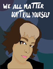
I started with a selfie where I thought I looked good and a selfie that I felt would be easy enough to work into a self-portrait on Illustrator. After choosing the selfie, I was able to trace it to make my self-portrait. This was the most intensive step. After this, I changed the background color to something more subtle with other variations of this color as blobs to make the background less boring. I added the text in white to make it stand out more than it would if it was black.
The vision was to make a poster that showed me on an anti-suicide poster to show that everyone is different and unique and that people shouldn't kill themselves no matter their differences and hardships. My style is unique and I have faced hardships over this as well as many other things. I have struggled with depression and other things in my life and I have lived to tell the tale and I wanted this to be brought into my work.
Wednesday, February 14, 2024
Logo
Sketches
For the sketches I focused on different aspects of things that make me as a person. I chose a different aspect for each of the sketches instead of just focusing on one aspect for each of them. Each of the sketches have their own meaning in relation to me. Some of them might have some of the same meanings, but not all of the meanings of each are the same. Most of the sketches have multiple meanings behind them.I chose five favorites, the bat, the mushroom, the paw, the moth, and the cat head. From these I chose two that I like even more than the others, the mushroom and the paw. From these two I ultimately chose the paw as my favorite.
Black and White
After choosing to continue with the paw, I drew it up in illustrator, blocking out the different shapes with black, white, and grey to distinguish them from each other. I chose to make the claws darker in order to make them more visible when the logo is shrunk down. The paw pads were decided to be lighter in order to match more of the actual cat paw vibe, with their lighter paw pads.Color Versions and Artist Statement
I made a few different color versions with different meanings depending on the colors used in them. The favorite ends up being the brown one with the purple paw pads.Each color has a different meaning. The purple, which is used in two of the logos, shows imagination, which I pride myself on. Pink, which is also used in two of the logos shows compassion and love, both of which I have a lot of. I have a lot of compassion in people, and I also have a lot of love to spread around. The green in the bottom logo shows healing, which I am working on. It also shows the healing that I have already sone to make it to this point. The brown in the middle logo shows friendliness, which I try to have with people. I work on my friendliness and try to trust people more, which is shown with the brown color. The black and white are there for some contrast, but the black also represents my power in my own life, which I am working on taking back.
Business Card
I chose different shades of the colors from within my logo to make the logo not blend in with the background. I also chose a few different ...

-
I chose different shades of the colors from within my logo to make the logo not blend in with the background. I also chose a few different ...
-
I decided to take the most well-known scene from my favorite series and edit myself into it. I decided to make the pose where I was on the...
-
(32) Tweening/Keyframing in Photoshop Animation- A Lazy Tutorial - YouTube Tweening is an easy way to make a small animation in Photoshop....


